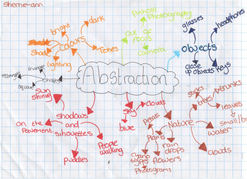
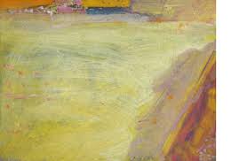
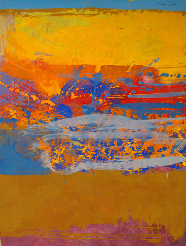
My definition of Abstract is: Thinking outside the box. When saying thinking outside the box I mean not just taking a picture of anything that just looks weird to you, I mean take your time and think about the shapes, colours, shade and where they are positioned. You should also think beyond or take it from another perspective.
Formal Elements
|
Focus:
Light: Line: Repetition: Shape: Space: Texture: Value/Tone: |
Which areas appear clearest or sharpest in the photograph? Which do not?
Which areas of the photograph are brightest? Are there any shadows? Does the photograph allow you to guess the time of day? Is the light natural or artificial? Harsh or soft? Reflected or direct? Are there objects in the photograph that act as lines? Are they straight, curvy, thin, thick? Do the lines create direction in the photograph? Do they outline? Do the lines show movement or energy? Are there any objects, shapes or lines which repeat and create a pattern? Do you see geometric (straight edged) or organic (curvy) shapes? Which are they? Is there depth to the photograph or does it seem shallow? What creates this appearance? Are there important negative (empty) spaces in addition to positive (solid) spaces? Is there depth created by spatial illusions i.e. perspective? If you could touch the surface of the photograph how would it feel? How do the objects in the picture look like they would feel? Is there a range of tones from dark to light? Where is the darkest value? Where is the lightest? |
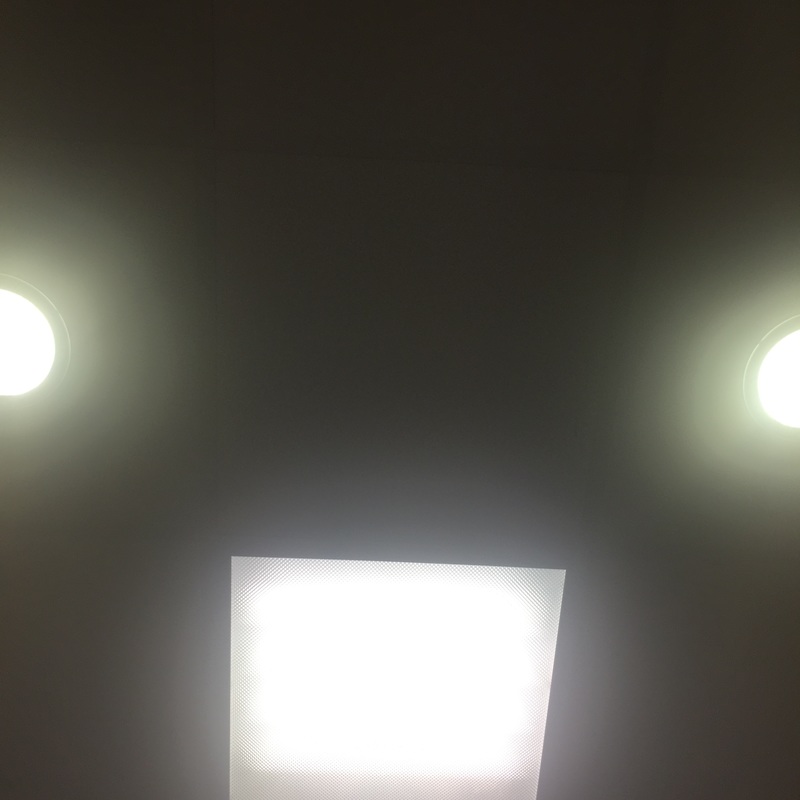
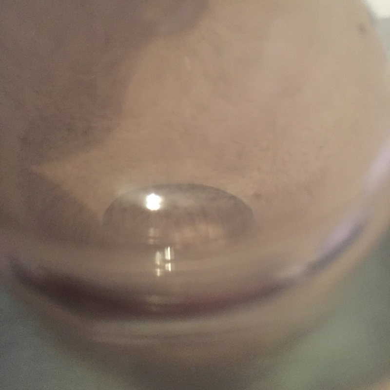
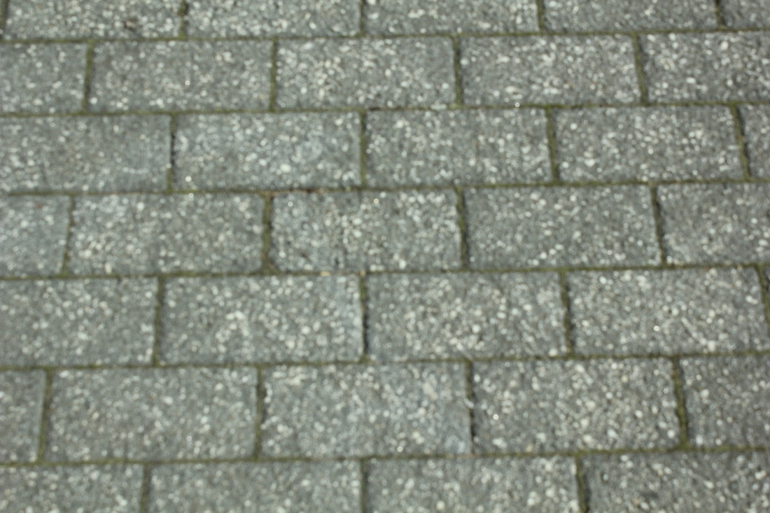
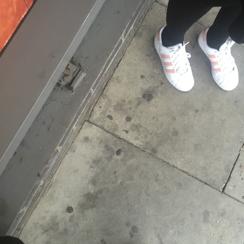
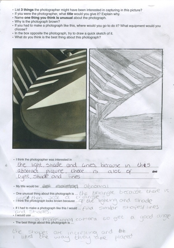
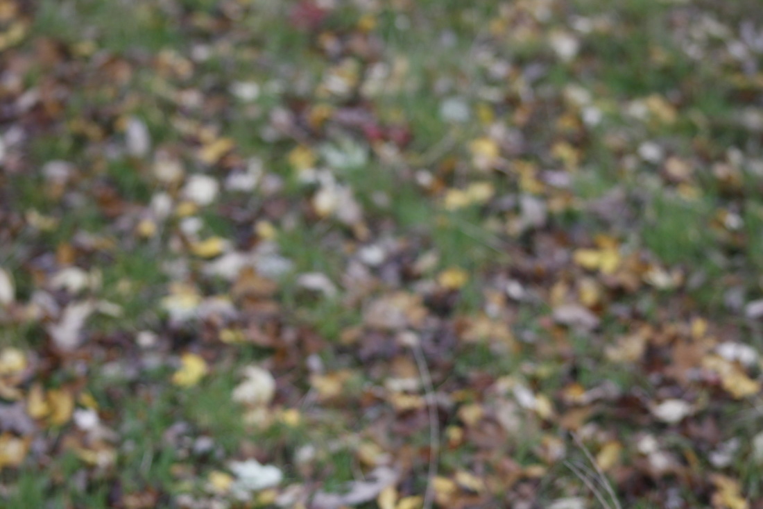
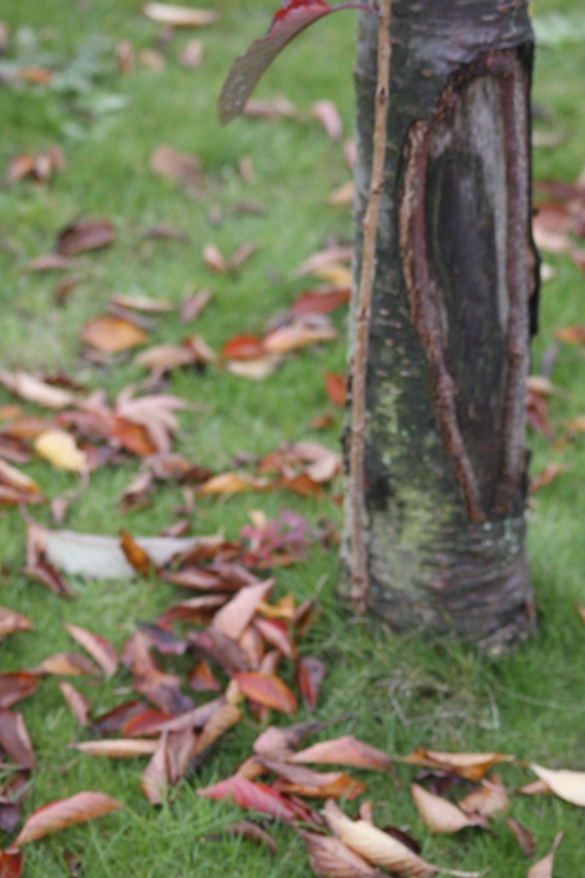
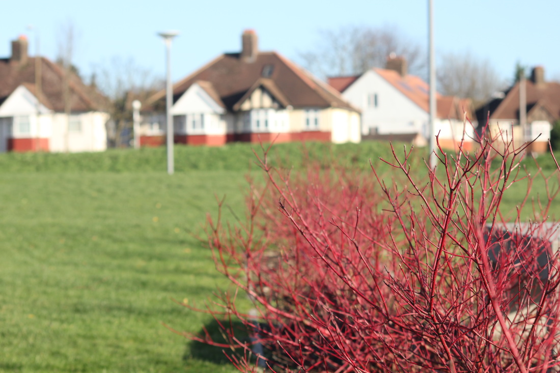
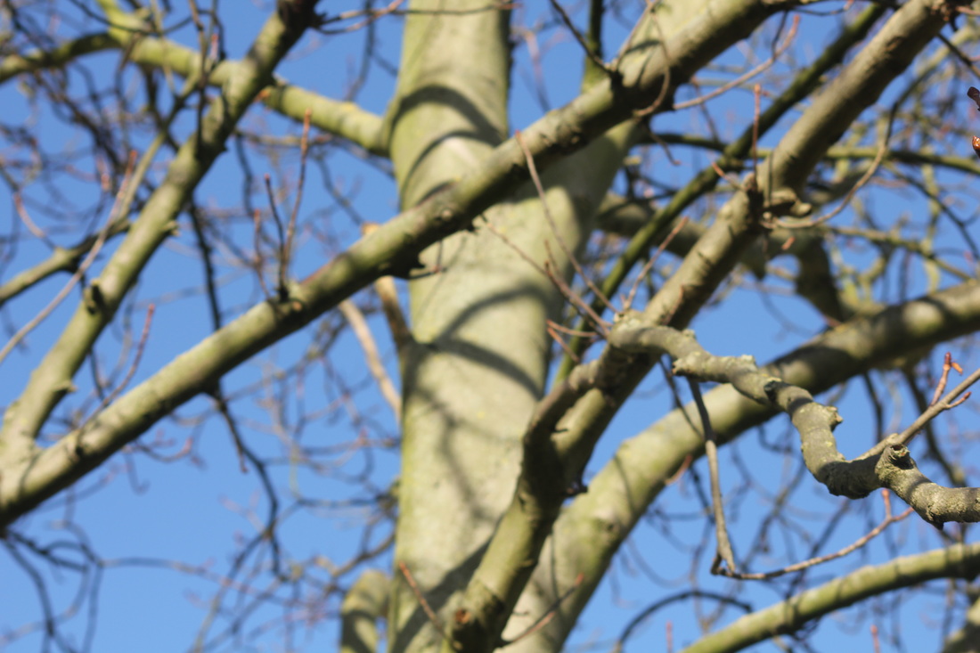
The formal element I chose to imply in my work was Shape and Line. The reason for this is because we see many different shapes and lines in our everyday life and they can become very abstract. But it's the way you interpret the picture to see if you understand the image. The images above comply with the formal element but what I could do to improve these is take time photographing them and edit them after to see differences ad changes.
|
This image is by Annie Leibovitz, and she is a photographer who mainly works on Disney but this is one focuses on abstraction. This is because it can be difficult to understand it as it is camouflage. At first when looking at it you don't know what the image actually is but once looking closer and identifying the shapes and lines you can see, that there is a person in the middle and that the picture is made to look like the inside of a house, most likely the living room.
|
|
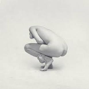
This image is by Ivring Penn, I found this interesting because you can barely see the persons head and the background and person is white, it's not as blended in but it its still abstract. This image consists of an formal element which is mainly shape. Another reason I have a liking or this image is because the body is bent forward as if it is in some kind of pain. When first looking at this image I thought it was dull however after looking deeper into it I realised that it may have deeper meanings than it shows.
|
PHOTOGRAMS
We are refining and improving our previous works on photograms. We will be experimenting with different objects and seeing how the tones can change with each object, whether it would be a really bright white, grey or just black. Many mistakes are made. For example you can expose the light onto the paper for too long then your whole photogram can become black.
WHAT IS A PHOTOGRAM & HOW TO CREATE ONE
A photogram is similar to a cyanotype but different at the same time. A photogram is a picture produced with photographic materials, such as light-sensitive paper and without a camera. Photograms are made when you use three different chemicals. These are; Developer which is first, then you have the stop bath and before putting the photogram in the water you put it the fix. Before putting it in the chemicals you have to create the photogram with the objects you have chosen the place them on the photographic paper. After this you leave it under the light for 8-10seconds, and when the time is up, turn off the light and put it in the chemicals.
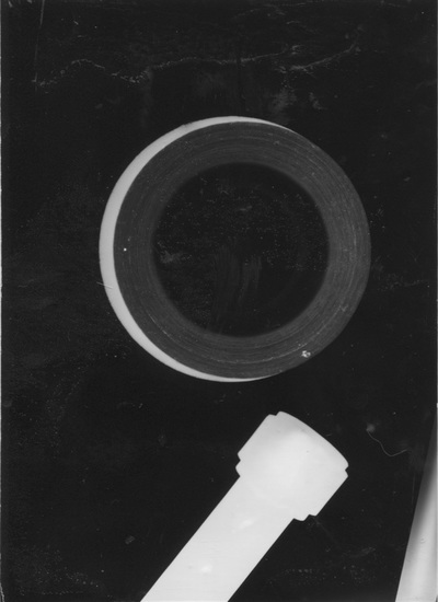
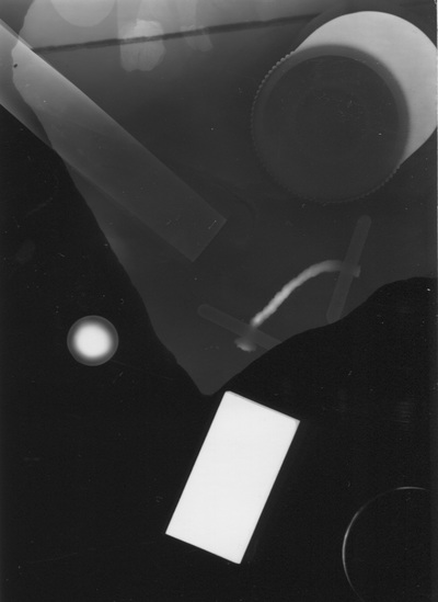
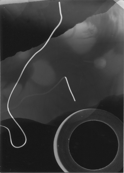
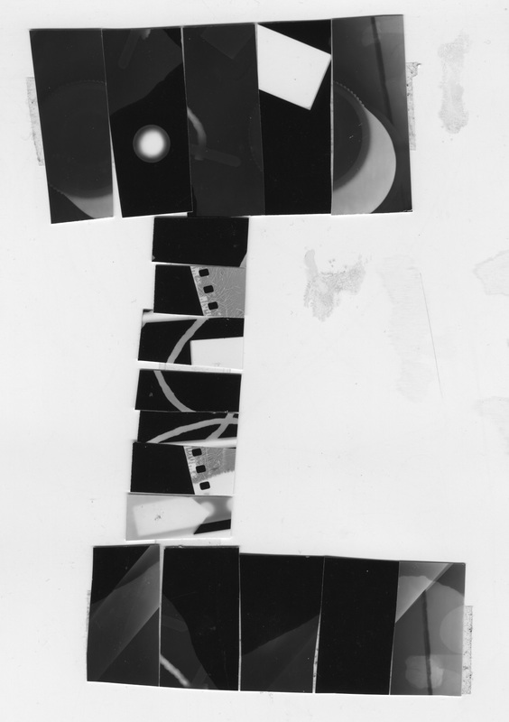
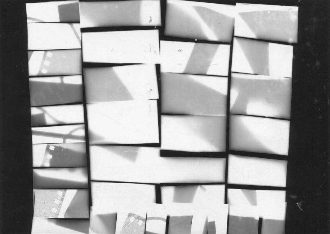
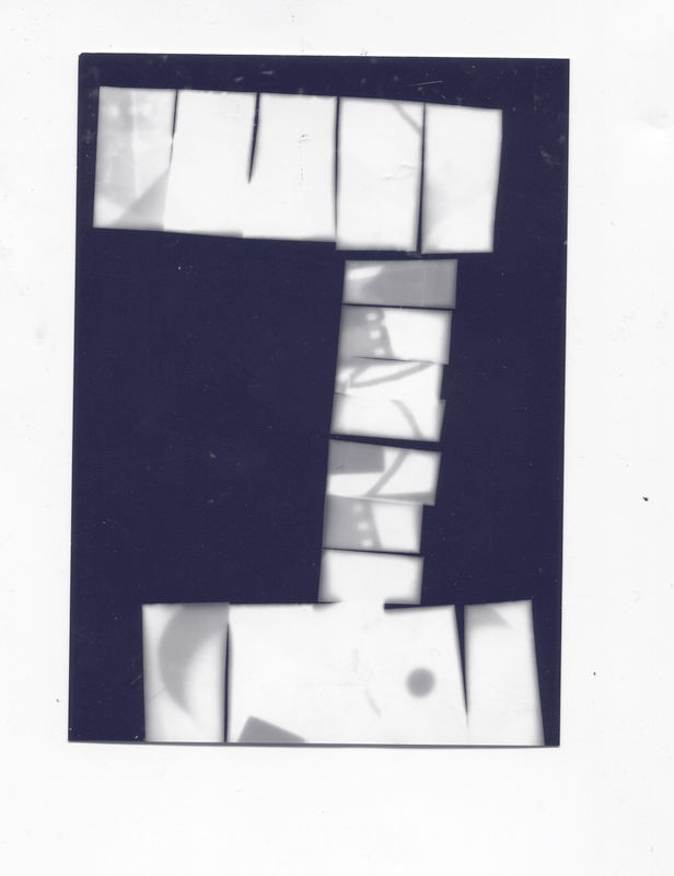
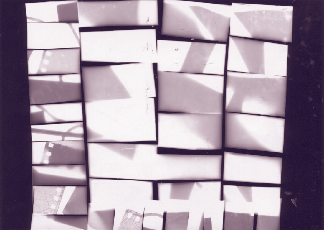
These images are my photograms. The first 3 were my first try's at making photograms after a long period of time. The others are more developed and abstract as you can't exactly tell what they are. They also have more objects on them then the first 3 images. I also included my duotones that I made via Photoshop.
WWW: Firstly, all the shadows and tones are different to each other which I like because even though you can not make out what the objects are, you can clearly see the shapes. I also like in how the third photo all of the shapes and objects overlap each other and are translucent.
EBI: These images would be even better if I had more objects on the paper and parted so it would look more 'abstract'. And the light wasn't exposed as much, because in the first image, there was loads more objects but the paper was exposed to light, too much and ruined the photogram.
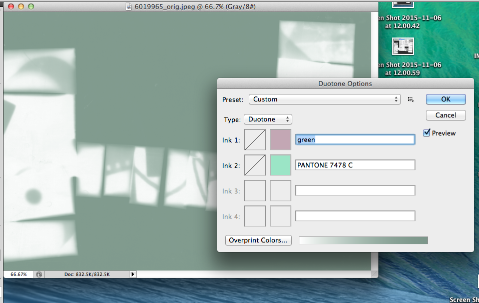
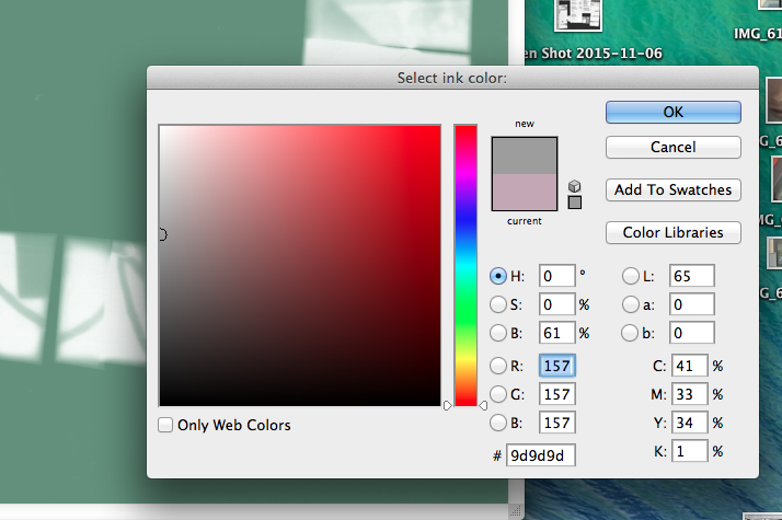
The Process Of Making Duotones.
3 IDEAS TO HELP WITH MY PHOTOGRAMS.
- My first idea is to use more objects the reason for this is because, when you use more objects it makes the image look more abstract.
- My second idea is to cut out different shapes e.g. triangles. This is because
the more shapes you use the more abstract it becomes
mainly different triangles this is because the more shapes put together the more abstract it becomes. - .My third idea is to try and splatter the developer on the paper. I am going to do this twice and my prediction is that the second will come out better than the first.
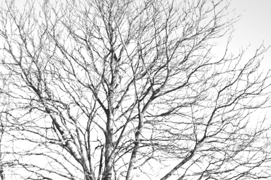
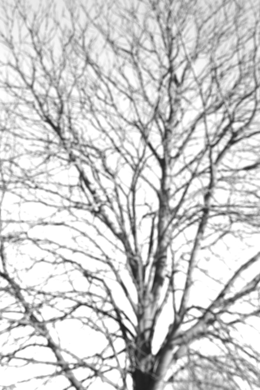
HARRY CALLAHAN
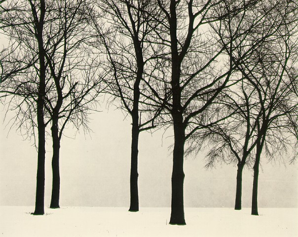
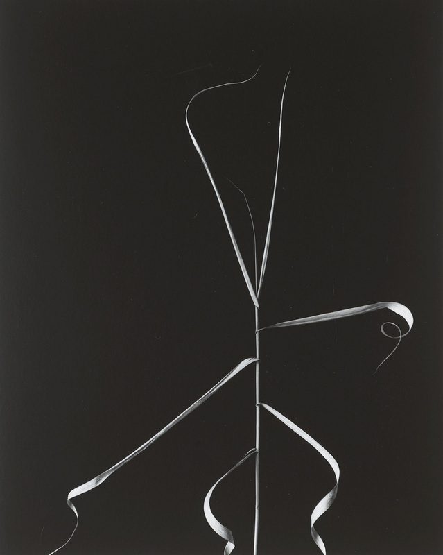
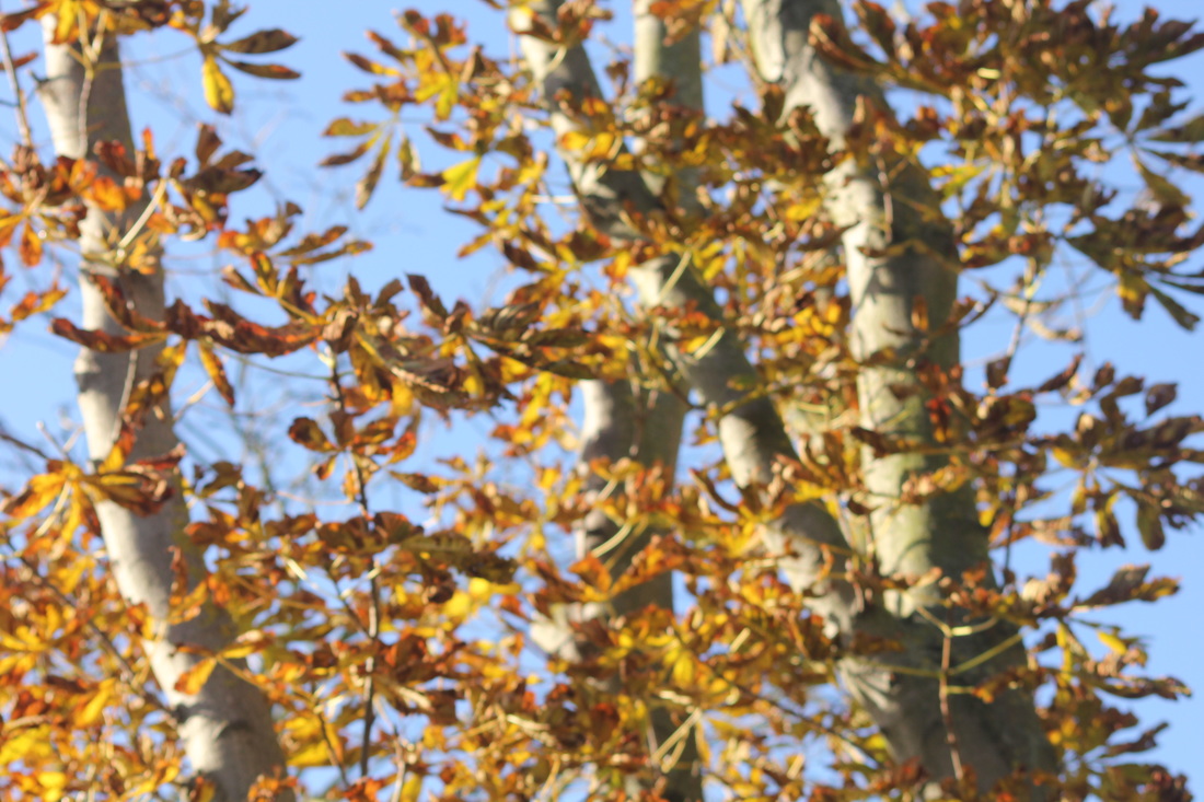
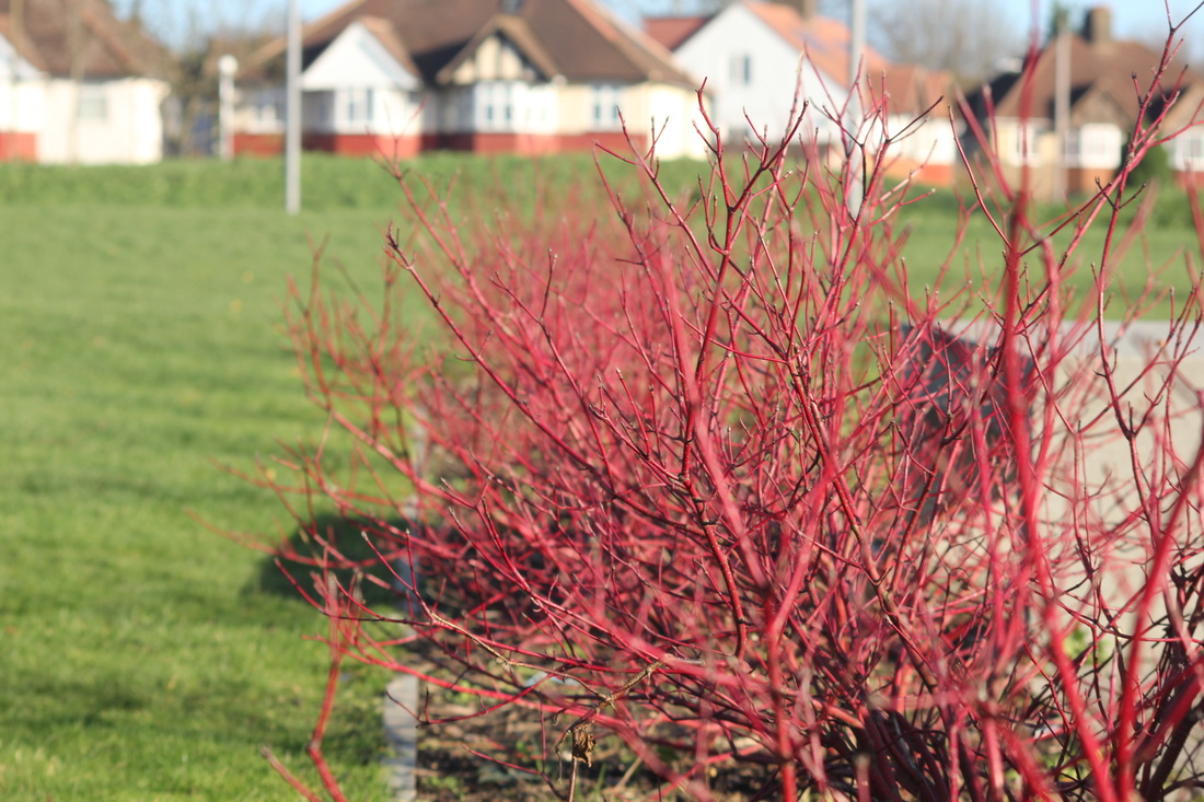
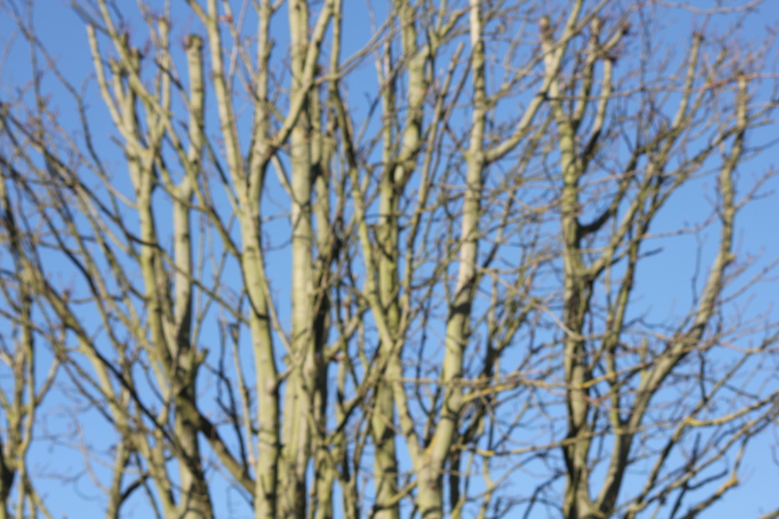
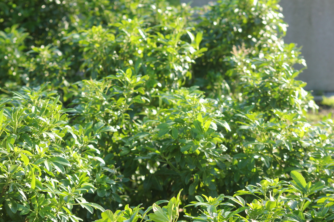
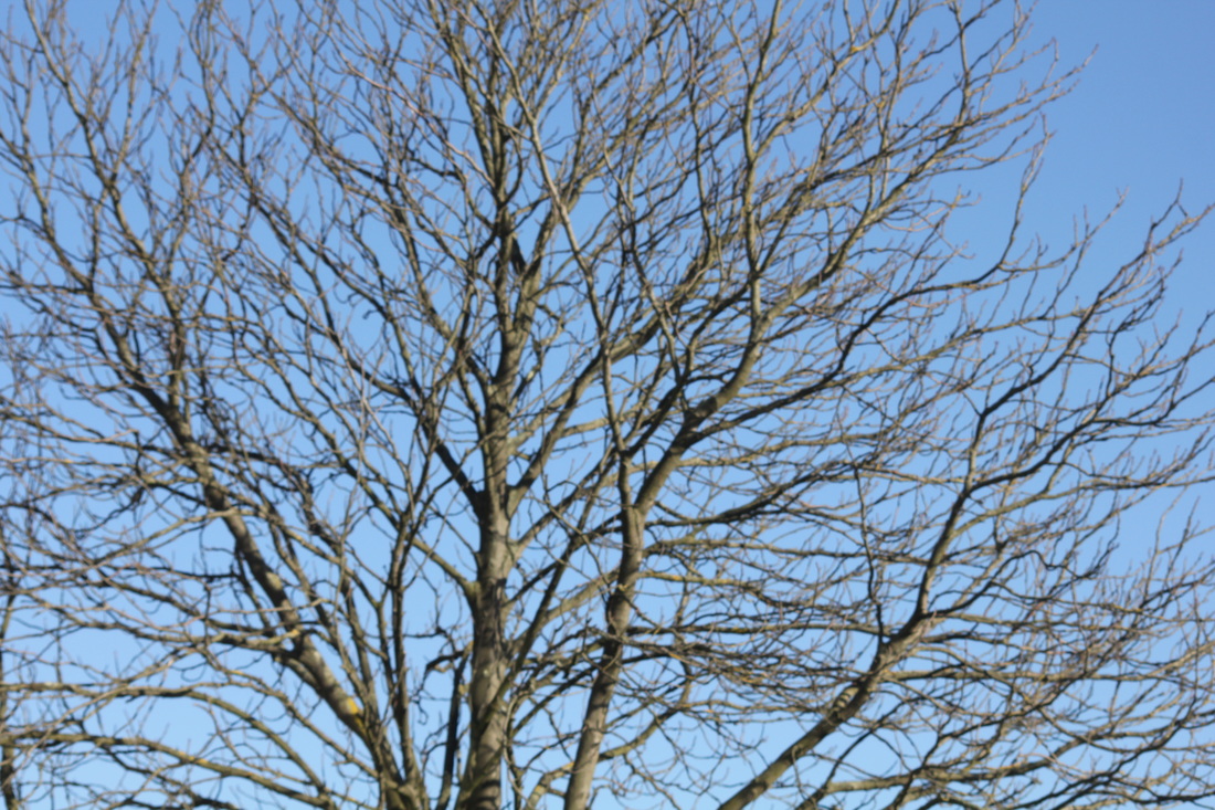
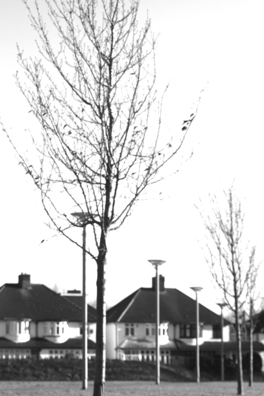
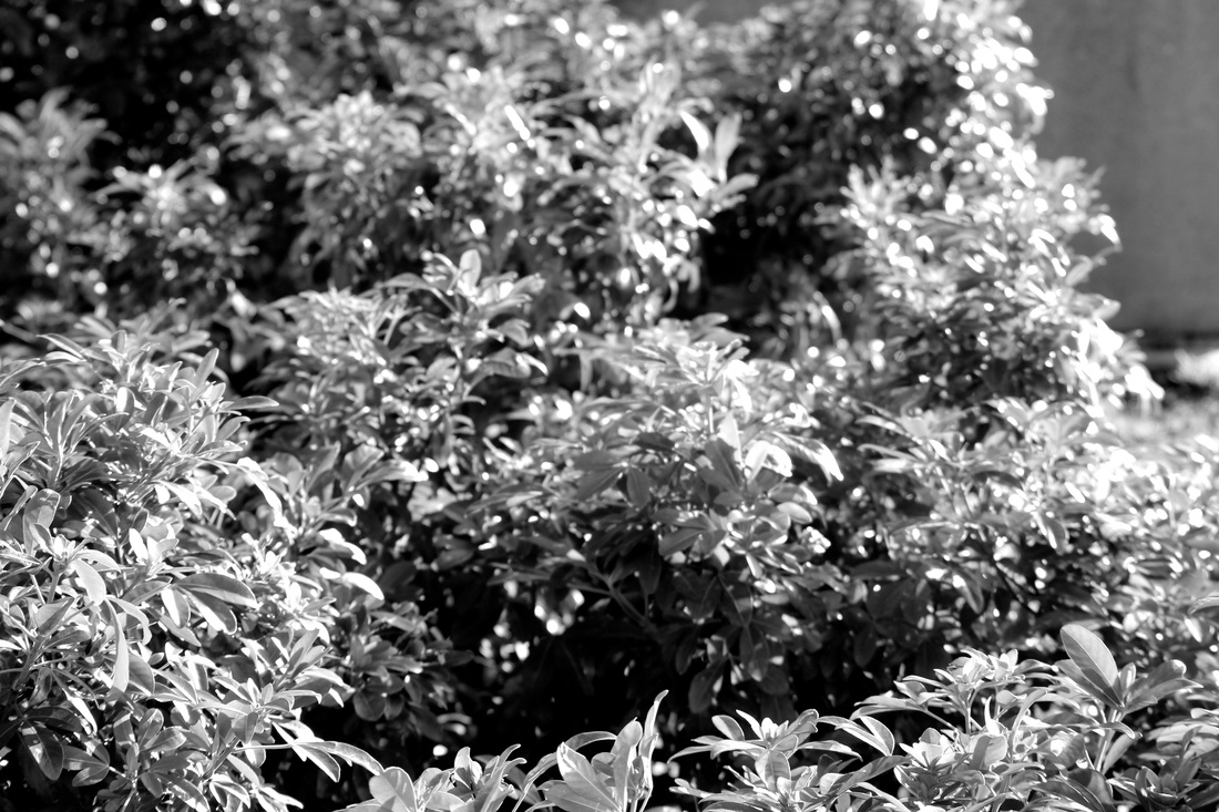
I am basing my research on Harry Callahan. I like they way his photographs are of nature and the patterns and repetition. The photographs he takes are mostly high in contrast, meaning they are strong and bold. When taking my own photographs, I will use what I have learned from looking at Callahan's to interpret my own design and set of images. He focuses on the details of plant.
RESPONSE TO HARRY CALLAHAN
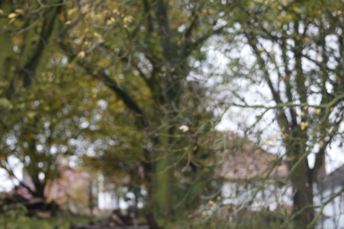
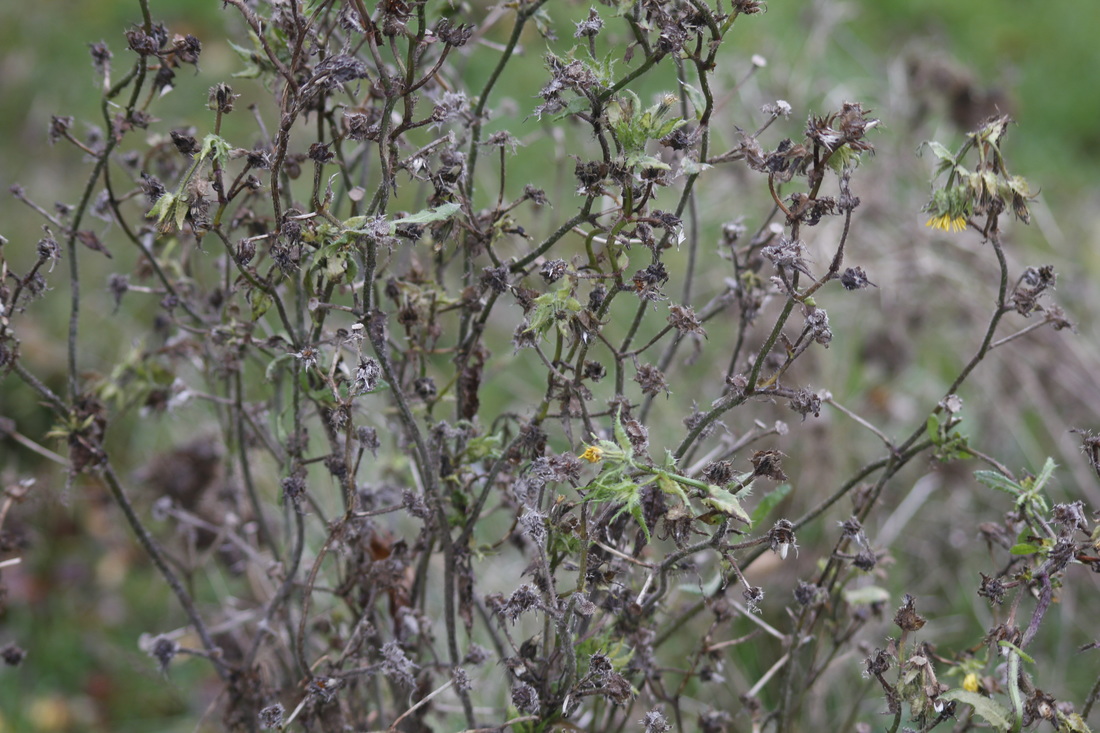
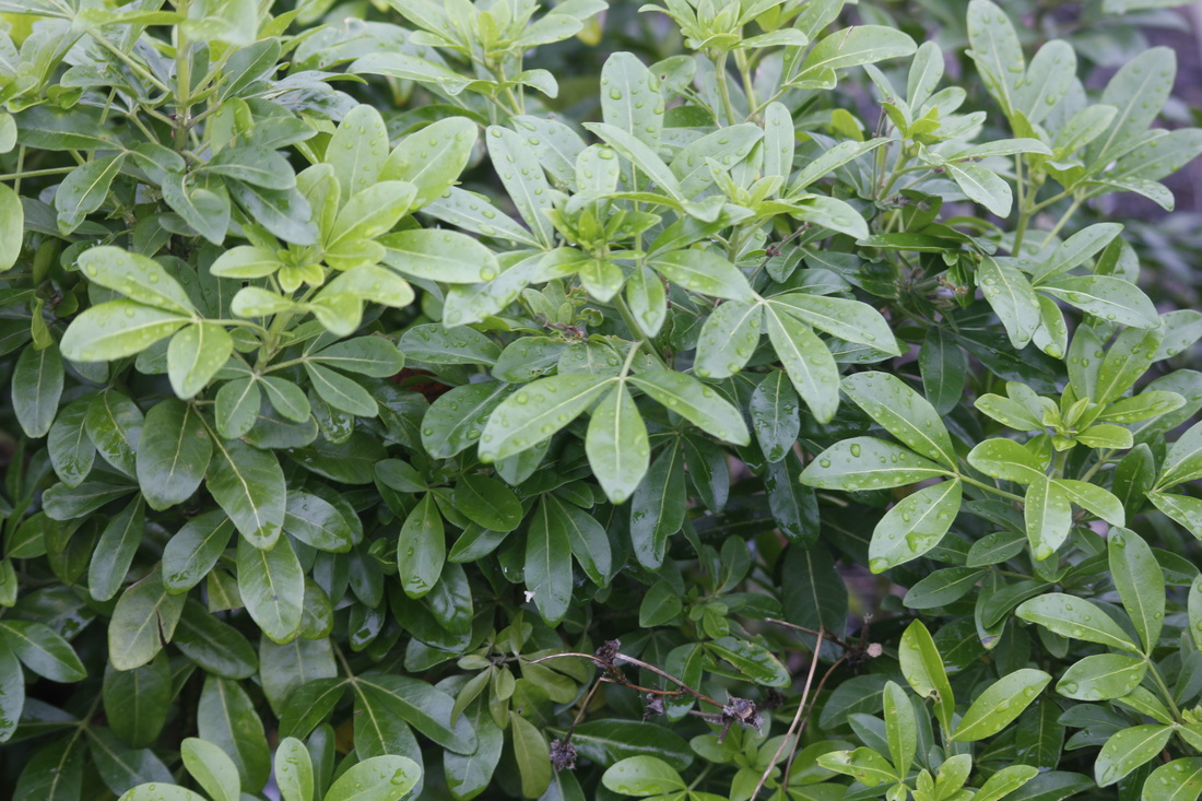
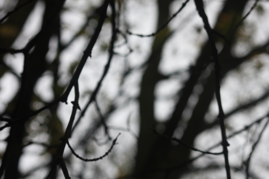
These images are inspired by Callahan's work. I'm interested in taking photographs of natural forms. I also like the way Harry, shows us the main idea of the pictures and leaves out any unnecessary detail. The textures and colours will be emphasised, to make them more deep and interesting. In my photographs, I tried to have one main focus and the background mainly blurred. I like that style, because it has a certain effect on the image making it more bold.
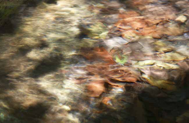
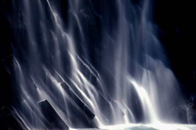
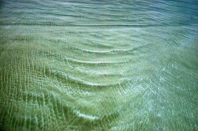
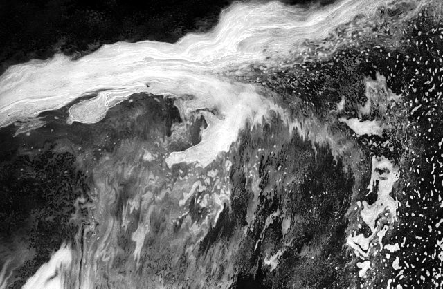
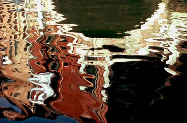
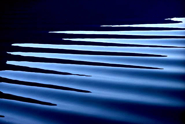
Another photographer who shows their interest in abstraction would be Ernst Haas. He was born March 2, 1921- September 12 1986. He was a photojournalist and a pioneering colour photographer. He photographed water throughout his career fascinated by how it reflects light. The following images are some photographs by him. I like his photographs because they really capture your attention the way the shadow against the water reflects. They are very interesting.
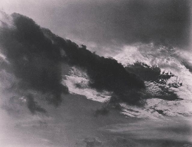
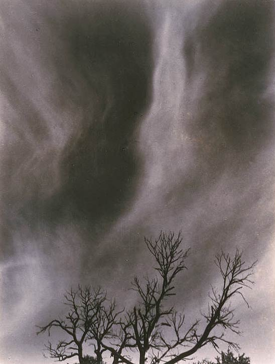
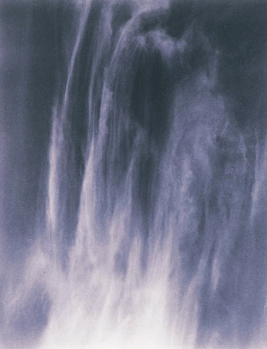
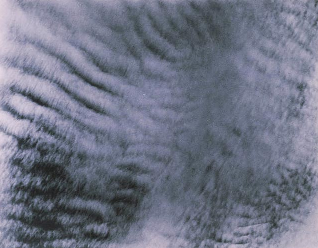
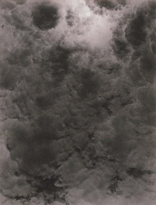
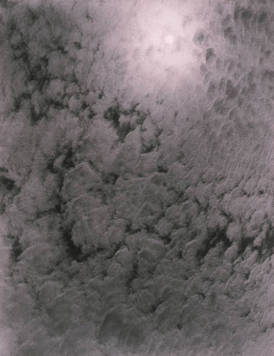
Alfred Stieglitz was born January 1864-July 13 1946. His main concentration in photography was based around clouds. He was demonstrating how to hold a movement. He's always known for the New York galleries he ran when he introduced avant-garde European artists to the U.S. Here are a few of his photographs.
ESSAY
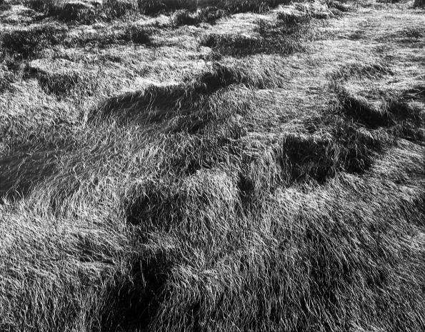
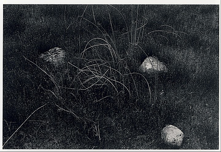
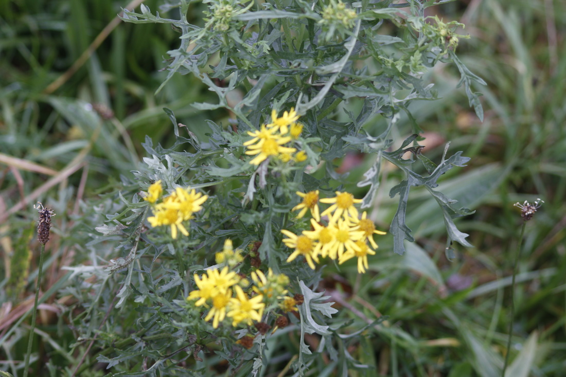
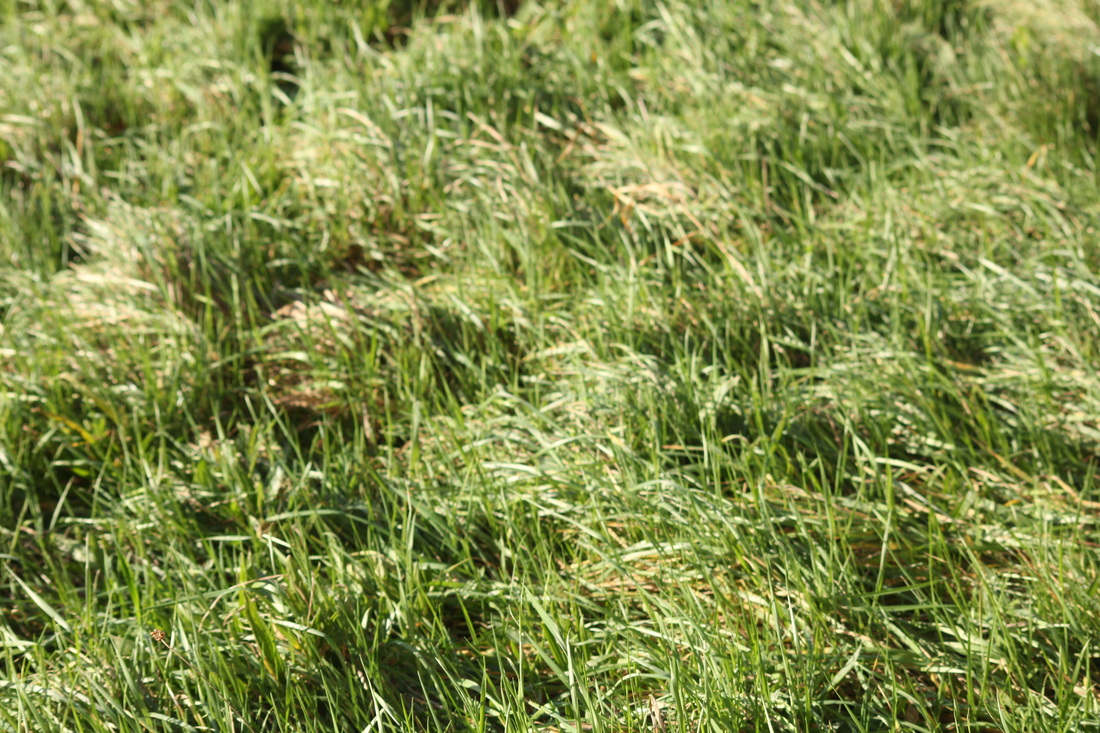
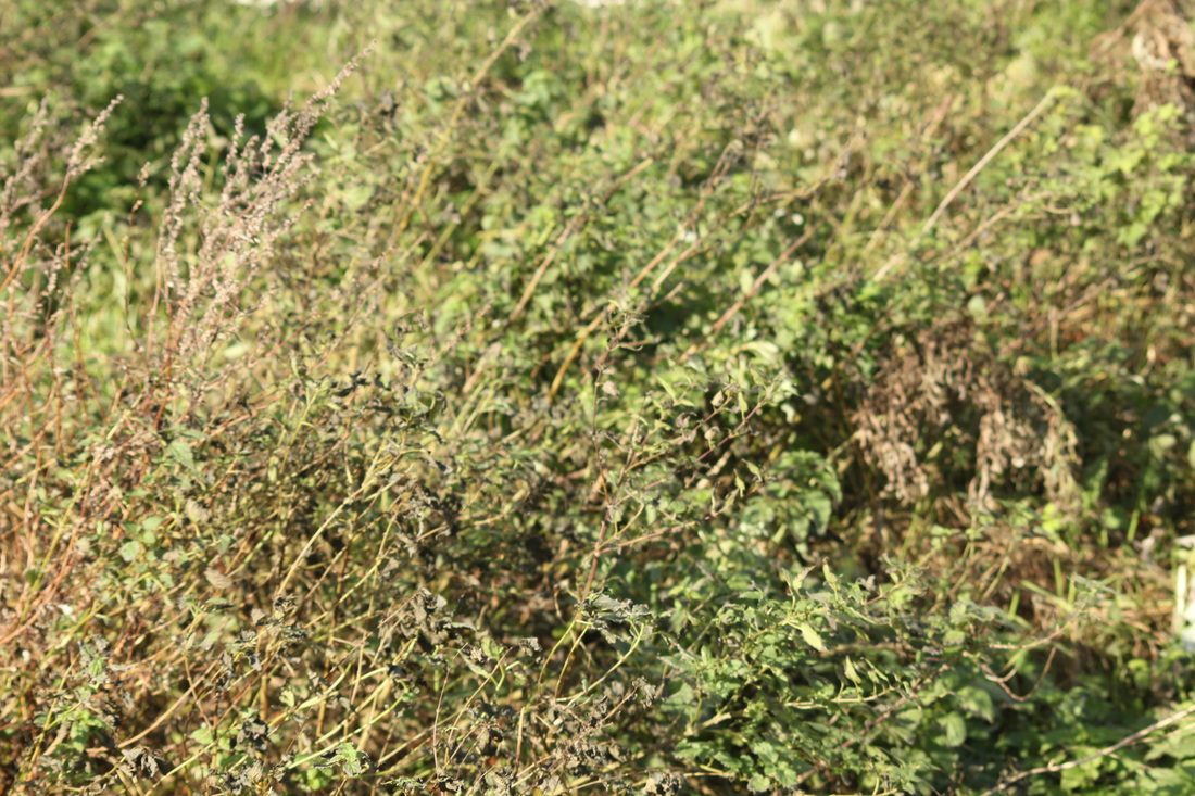
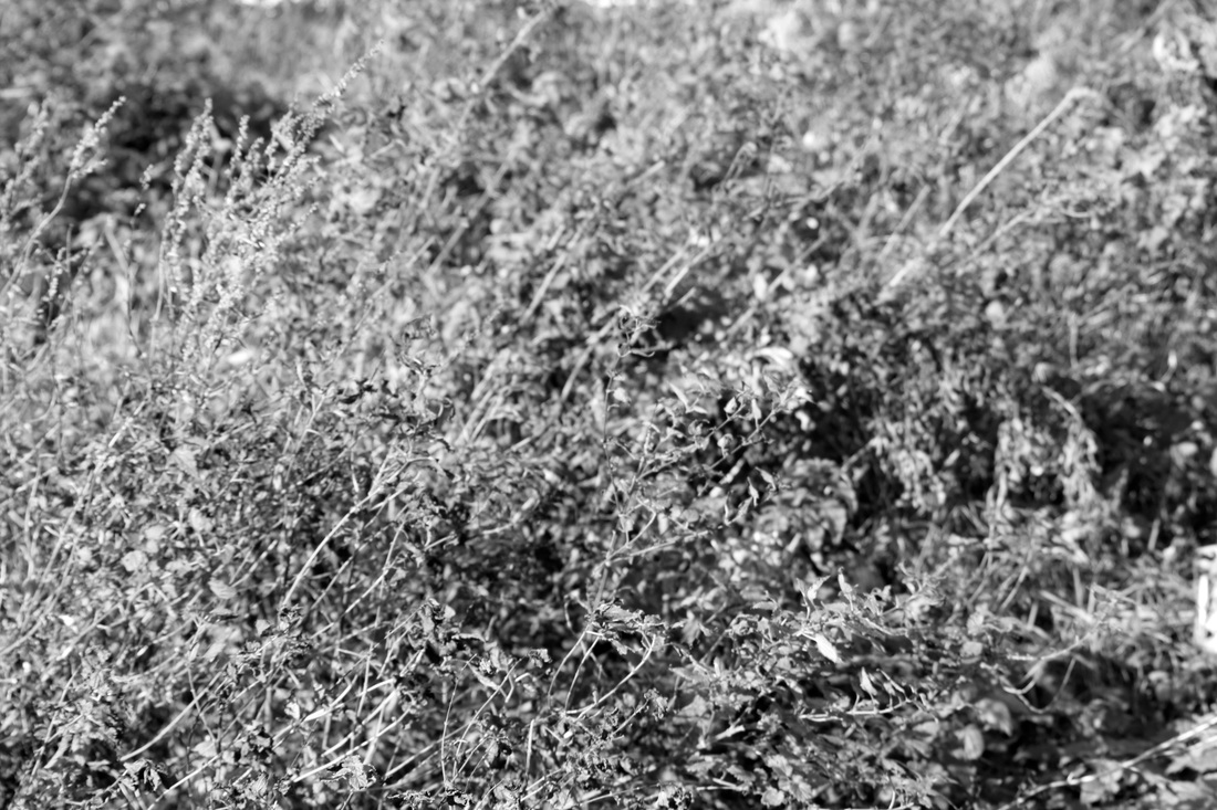
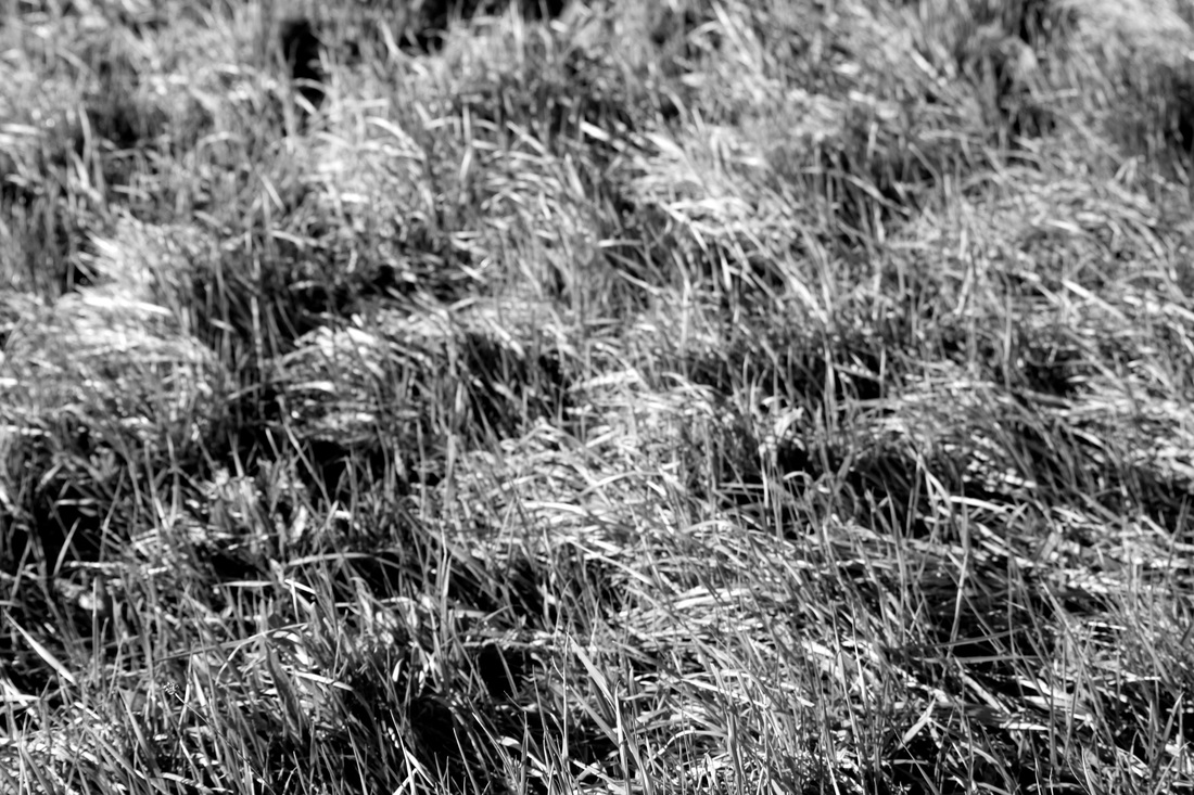
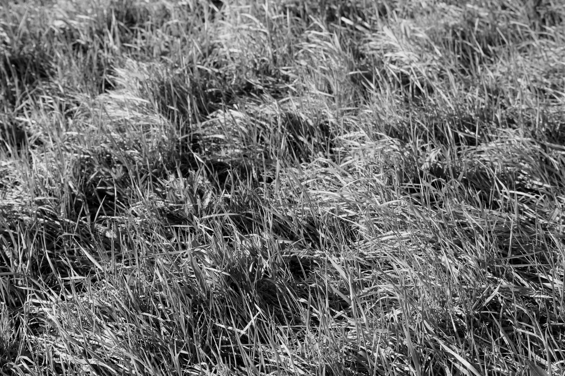
In this photography by Harry Callahan I can see lots of grass surrounding the area . It looks as if it's bee blown around by the wind. A word I would use to describe this picture would be "intriguing" the reason for this is because once looking at the image, it makes you more curious to understand it, especially because it's in black and white. If I was to describe this photograph to someone who has never seen it, I would say that it looks like a stack of hay covering rocks and the wind is blowing it around. To me this is naturalistic because although you may get confused on this image, you can easily guess it. To make it more abstract, I would've taken the picture while the camera wasn't in focus.
The type of equipment used to take this image would be a medium or large format film camera and Callahan most likely took many photographs before to get the right one. This photograph reminds me of the country-side, as it looks like unknown paths being covered and only shows one interpretation of the image. I like the texture and the tones in this picture. The tone because it's been edited to black and white. The texture because it draws attention to the picture. What interests me most about this work of art is the way he captures it. Callahan captures the image in a way where the viewers can see the wind moving the grass but it's still. It's like time has stopped for a short period. This photograph is different from reality because the picture is an illusion, that only shows you certain things but in real life you can see every and anything. Pictures are just pixels on a surface which makes them not necessarily real.
There is a very compressed sense of space in this photograph because it's been cropped. It makes the image look intense and claustrophobic. The picture is almost packed up with the grass to make it look this way. The picture is made in such a way the whole surface is interesting. The way the grass is positioned and in some places its separated makes the picture interesting. A question I would ask Harry Callahan would be why he only decided to capture the grass and no other subjects and why it's cropped. I would also ask why he decided to edit in black and white. I can discover that, Harry's main subject that he takes photographs of would be nature. For example tree's, grass, bushes and so on. This helps with my understanding of the work since it can inspire me to create my own similar images.
If I was asked to give this photograph a title I would call it "Blindness". The reason for this is because it doesn't show you reality, so the viewers are blind to the truth. Not much is occurring in this picture since it's trapped in time. But what you can interpret is that it was a windy day as the grass is in a different position to what it would normally be in. I got this idea from really studying it for a short period of time. When you look at it for longer than a minute it gives you a mental illusion and you would start to think its moving. I think this photograph is about realizing what's real life since to most viewers it's just an illusion, including me. I got this idea by again studying this image and realizing it has cropped reality.
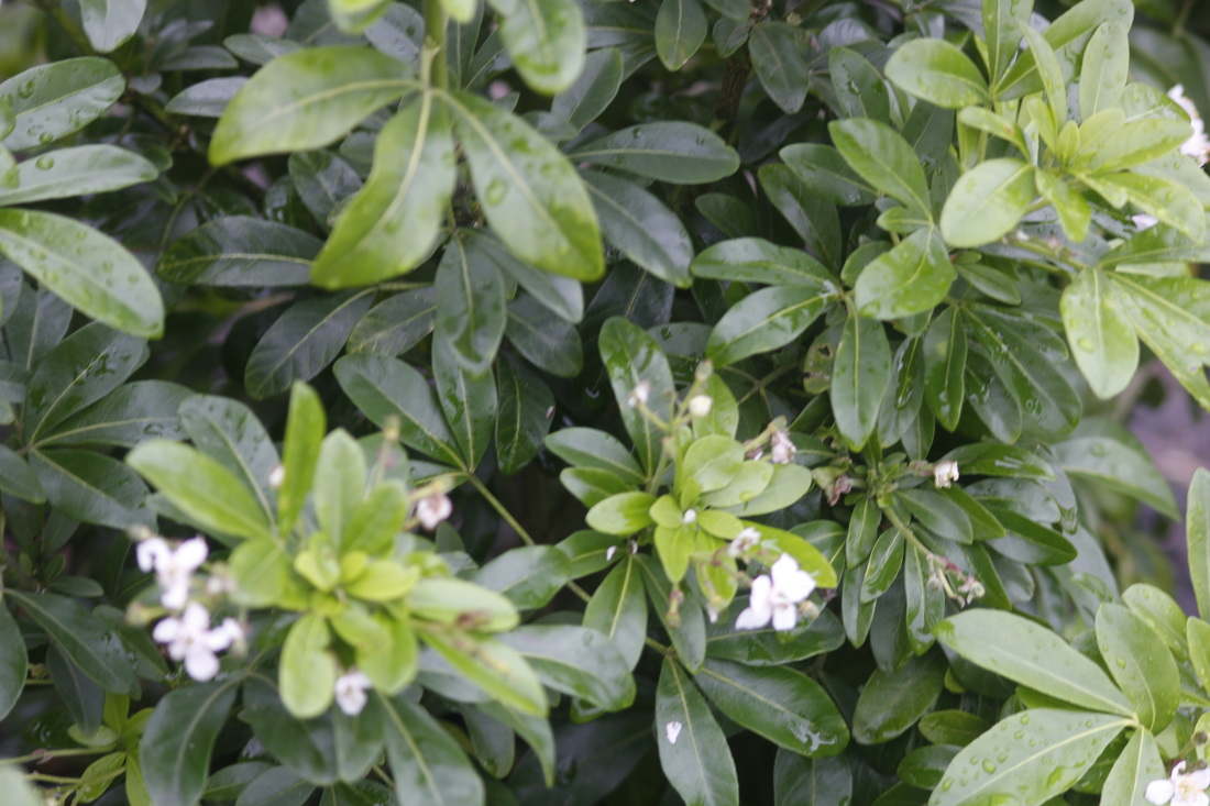
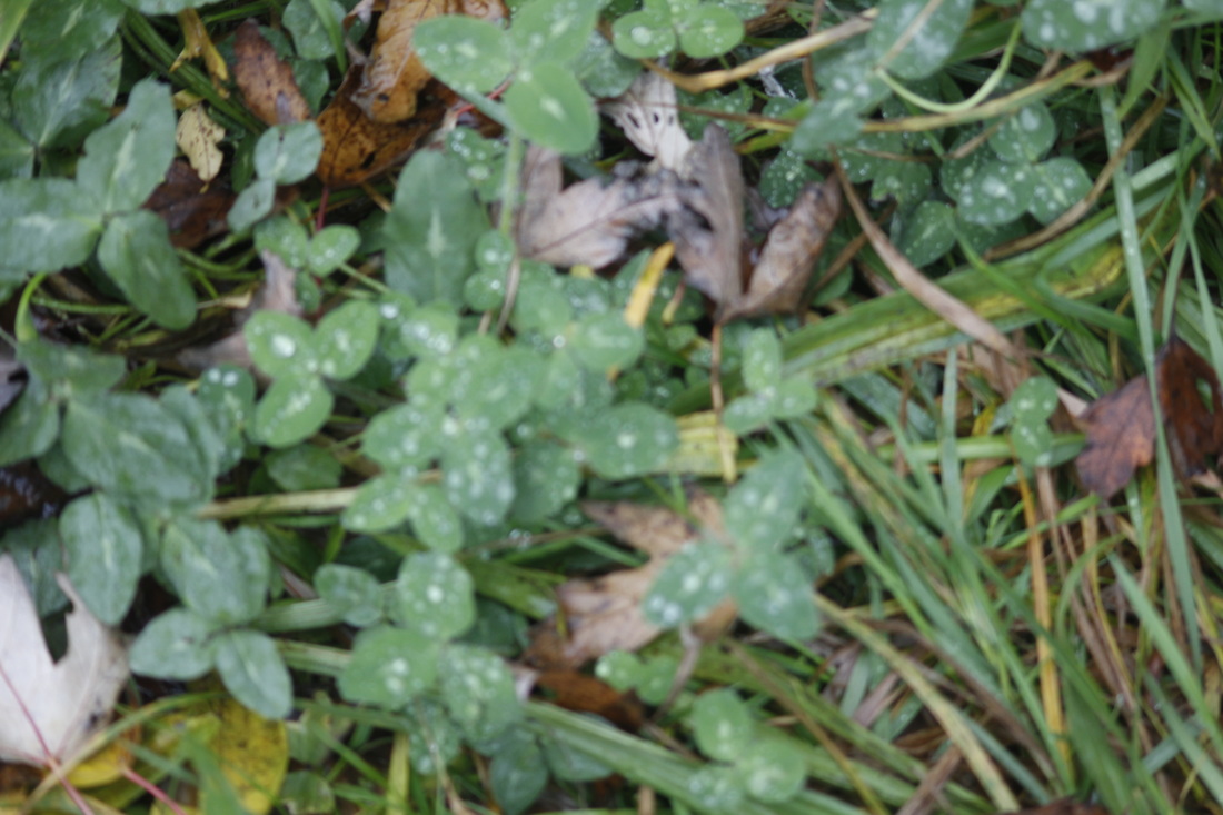
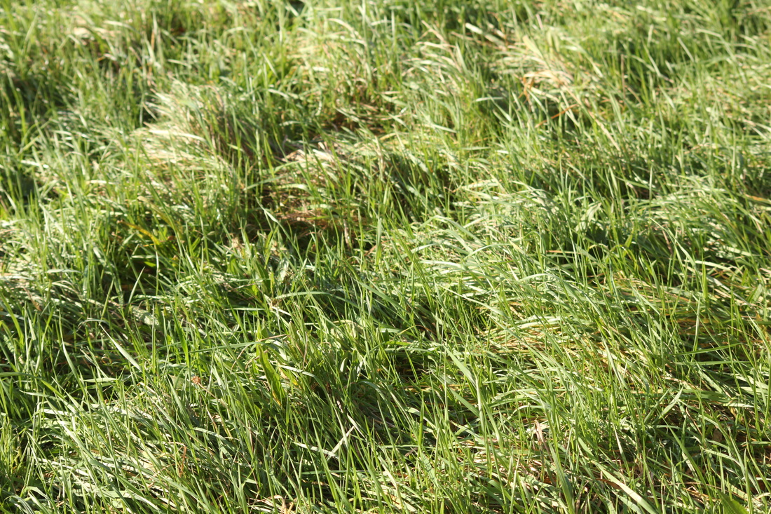
Harry Callahan takes photographs of natural forms and in the images below I tried to take similar photographs. The images after the 13 below are the same photographs but with edits, these being black and white and increasing and decreasing the contrast.
|
WWW: What I think went well with these
set of images is that they are similar to Harry's photographs and also like Callahan they are cropped so you can only see the cropped subject. |
EBI: These photographs would be even better if the wind blew the trees and grass out of proportion, to make them more abstract. Also what would make these photographs better would be if I took them in a different area so I could take them of different subjects.
|
These images are the edited versions of the original photographs. I did not add effects to some photographs mainly because they looked better without the edit. The images that are edited look great as they are not as realistic as they would look if they were back to original version.
How To Make A Photograph Like Ernst Haas- Instructions
.1. First you can choose from some of the formal elements, good elements for these type of images would be light, space, texture and focus. These will help you to create similar images to Ernst Haas.
2.Secondly most work revolved around Haas is water based not all photographs but some. To help take a water based image you need to think of a camera to use, an ideal camera would be a DSLR.
3. You need to keep an eye on the water to make sure not too much water is flowing in the same direction.
4.Keep the background simple.
5.(optional) Have a main focus that reflects onto the water, e.g. a person or tree.
6.If you have a timer on the camera or a remote with a tripod to take the images automatically instead of just holding the camera use one of the options above to get a clear picture.
7.Take more than one photograph too see if any look better than others and learn from any mistakes you made in the previous photographs.
8.After taking some shots if you choose to edit them, black & white would be the best idea.
9.Show friends your pictures and see what they think and if they think they are similar to Ernst Haas.
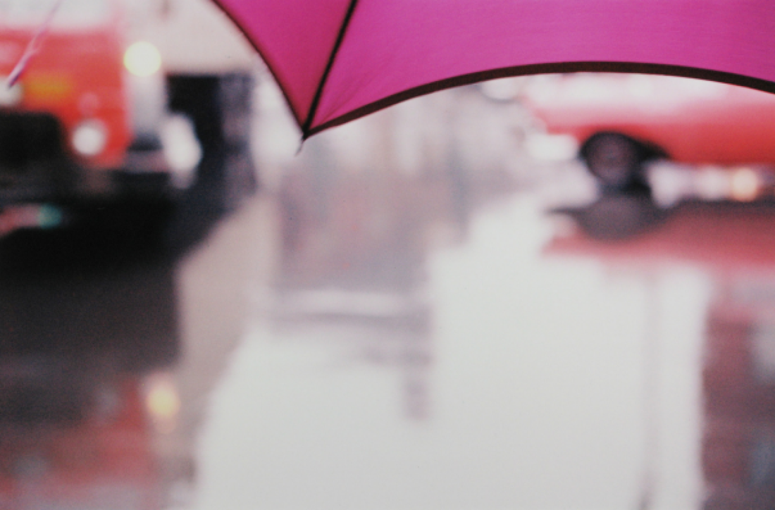
Saul Leiter
Saul Leiter was born on December 3rd 1923 and passed away on November 26th 2013. He was an American painter and photographer. His early work (1940-1950) was an important contribution to what came to be New York School of photography. He studied to become a rabbi but soon left theology school at 23 and moved to New York City to become an artist. His mother gave him his first camera at the age of 12 as he developed a new interest in panting. From his early work he worked as a fashion photographer for the next 20 years. Below are some of his photographs.
5 Characteristics that define Saul Leiters photographs.
- Large sections of the images are out of focus.
- He often obscures the view.
- He uses colour abstractly.
- He photographs things because of the shape and not because of what they are.
- In most of his pictures you can divide them into quarters and halts to part the photograph and you can get one section of the image n one of the quarters of halves. This is because of the way he photographs the image.

|
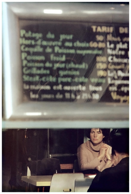
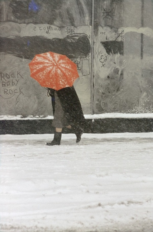
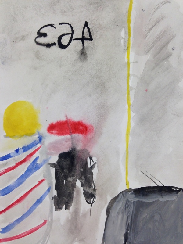
I chose this picture because of the colours, Leiter uses the colours abstractly, you can see some red in the background which isn't in focus but the main colour that Saul Leiter would be focusing on would be the pink umbrella with black outlines. Saul Leiters photographs also link to street photography, it features subjects in situations within public places. One of the formal elements that Leiter definitely focuses on would be focus. This because most of his pictures have one main focus and the rest of the image is blurred and not in focus. This could be a person or an object.
|
Photography allows you to learn to look and see. You begin to see things you'd never paid attention to. -Saul Leiter
I have chosen this quotation because it helps you to understand deeper meanings of photographs. Sometimes when you take photographs you don't really look at everything surrounding it and once you've taken it and start to look over it, you start to notice certain things you haven't seen before.
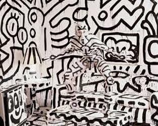
Saul Leiter Paintings
Compare & Contrast
|
|
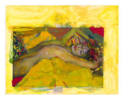
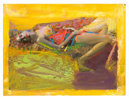
The painting is more abstract than the photograph. Although they are both abstract the painting shows more aspects than the photograph does. I think these two images are similar because they both have women and the colours stand out in each and they are similar colours. However they are very different because the photograph is more realistic and you can see every facial feature and in the painting its more close up and more of a visual imagination. When looking at the photograph my eyes move up then down diagonally then left to right across the centre following the light going across the women's face. When looking at the painting my eyes straight away move to the centre of the painting going up and down across the centre following the purple slash across the neck to the yellow lines on the head.
In both the photograph and painting I think the main focus is colour as the colours stand out the most in each.
In both the photograph and painting I think the main focus is colour as the colours stand out the most in each.
My Painting Response- Saul Leiter

|
|
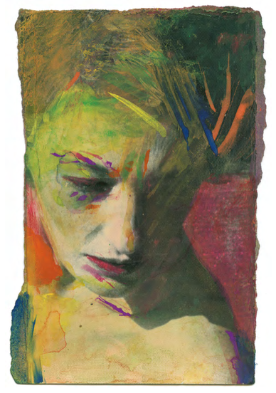
I chose to paint this photograph, because at first it looked like it would be the easiest one but once I started painting it I realised it was probably the hardest one. I especially liked the colours in this photograph because they stand out. Although my re-creation of it is not an ideal match, it looks similar. I could of easily went and tried to take an similar photograph to make them match but the painting is more abstract because it's not the same.
|
|
I tried to make another painting similar to Saul Leiter, I didn't take my time so it would be an exact match, I worked much quicker and my turn out wasn't as bad as I thought it would be.
|

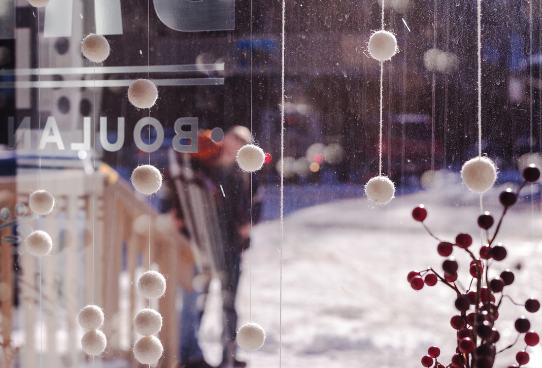
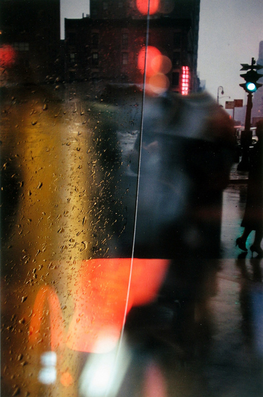
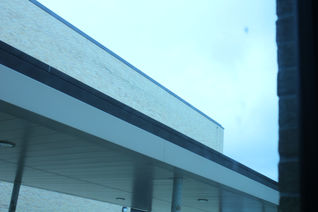
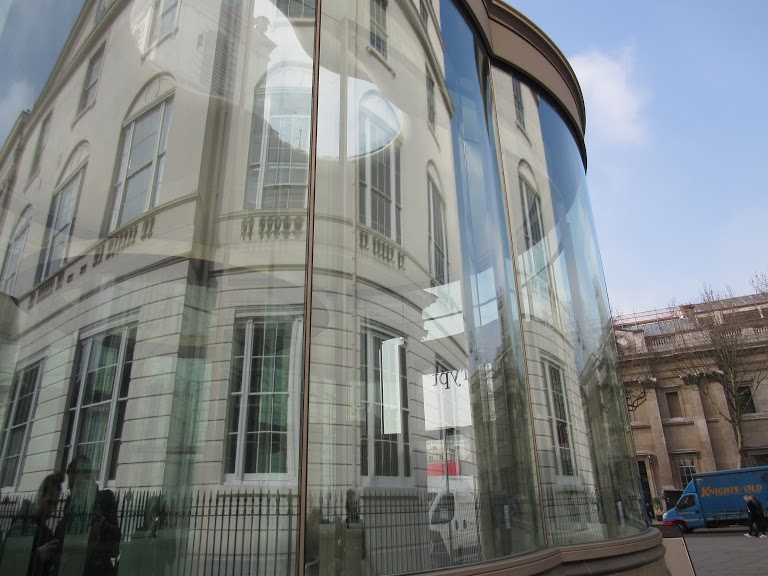
Views Through Glass
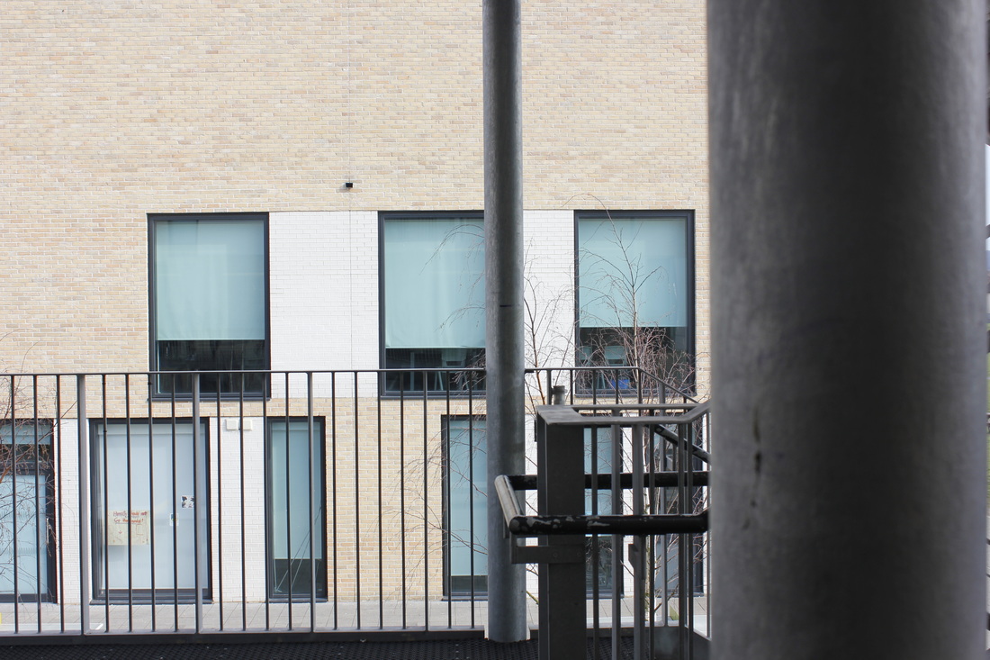
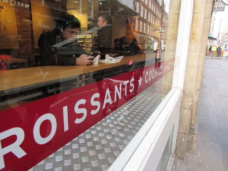
Based on Saul Leiters images I have taken photographs similar to him through glass. This works effectively because it explores reflection.
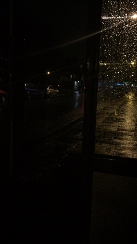
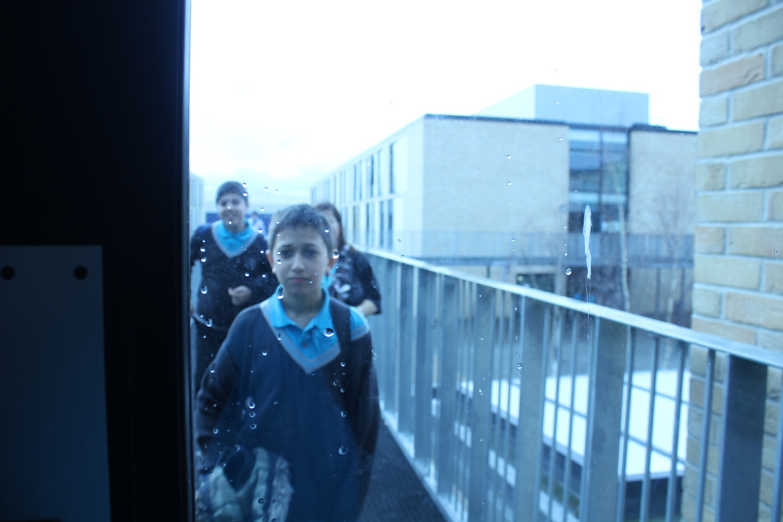
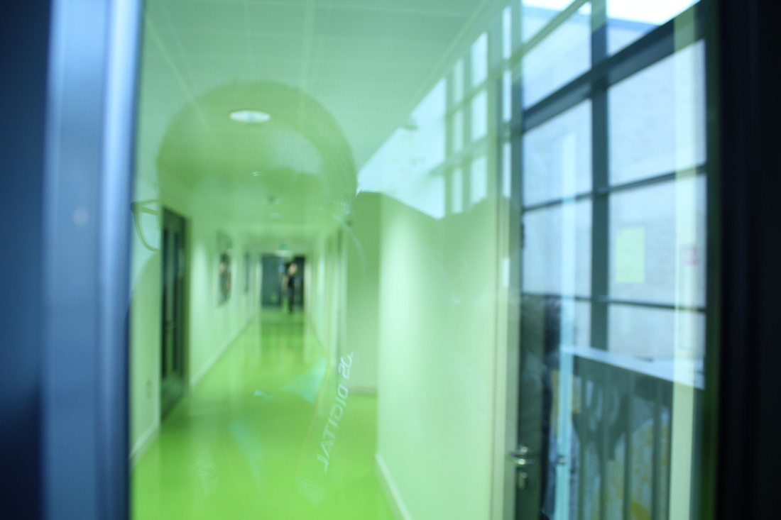


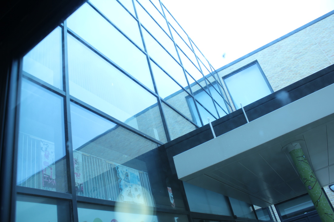
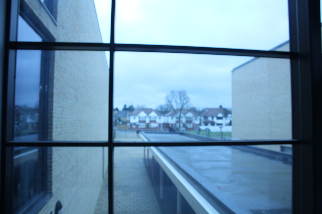
These images focus on reflection inspired by Saul Leiteir. What went well with these is that they show reflection well, each image was taken through a transparent object. I did this to see whether the image would look different behind something than by itself. The images reflect back showing whats in front of it. For example in one of the photographs you can see myself taking the image. To improve these photographs I could use flash this would help because it could change the image or even keep it the same.
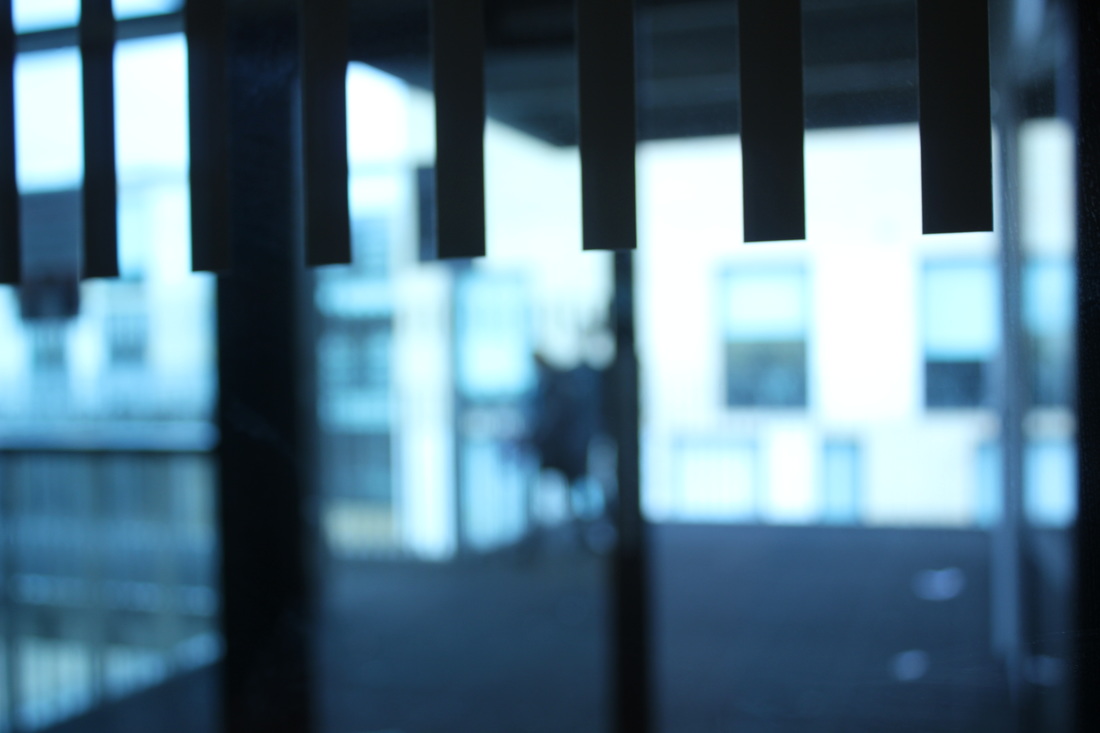
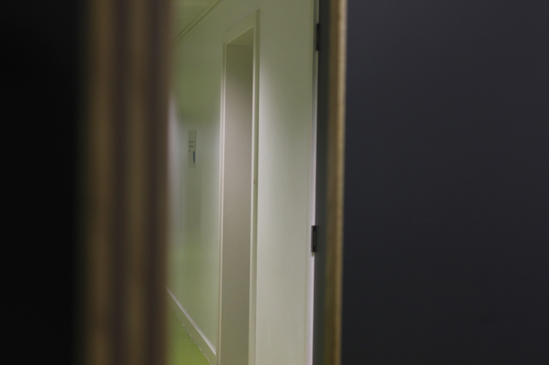
Obstructed Views
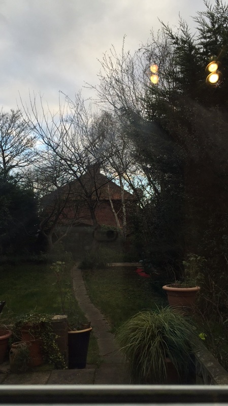
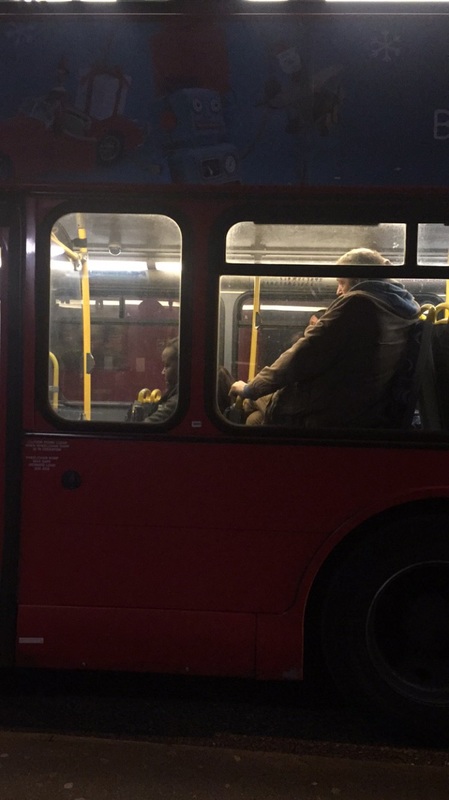
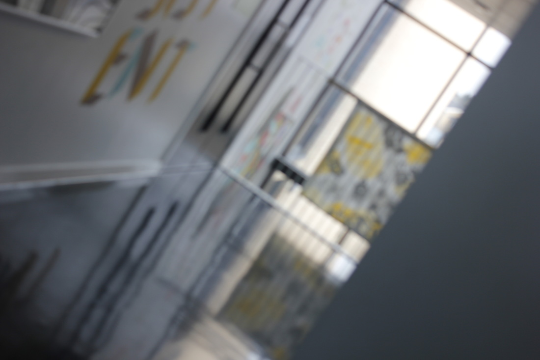
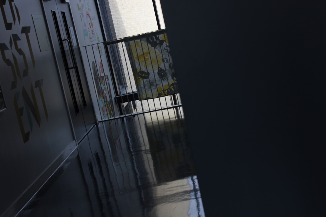
The images below focus on obstruction inspired by Leiter. Each image has something in the way, so therefore you can't see the full image or at least what is meant to be seen. I enjoy focusing on obstruction because if you take a photograph with a object in the way you can focus the camera on either the object blocking the view or the picture behind it.
These two photos below are the same but one is just edited. When looking at the after image I can see a more developed image, the before photograph is much more dull and there is not as much contrast in it. You can easily make an after image without even editing it, to do this I think you would have to think about the lighting, what angle you take the image at and if it is focused in the correct position.
Before After

|
|
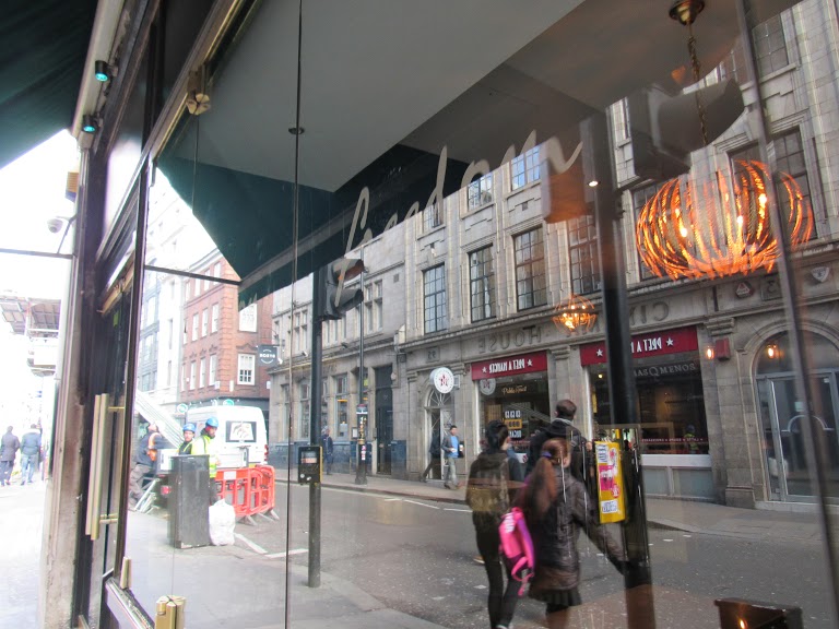
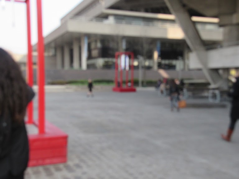
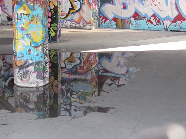
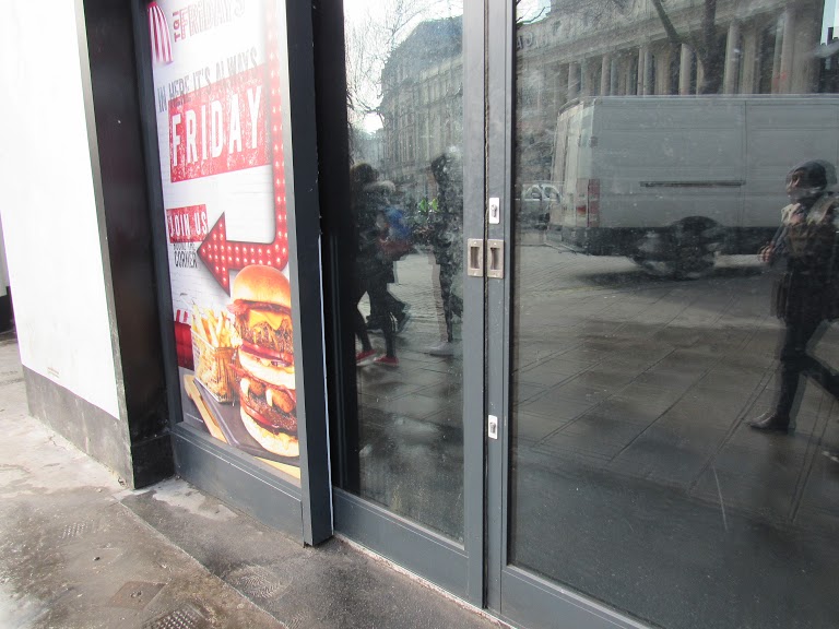
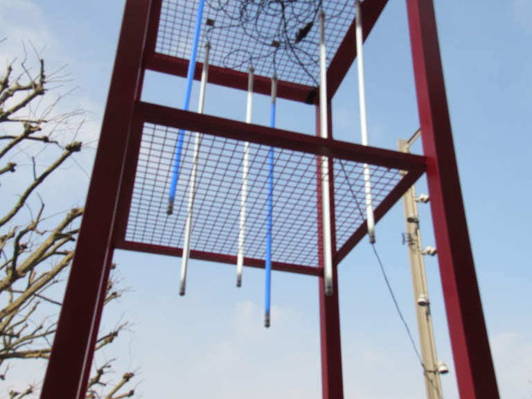
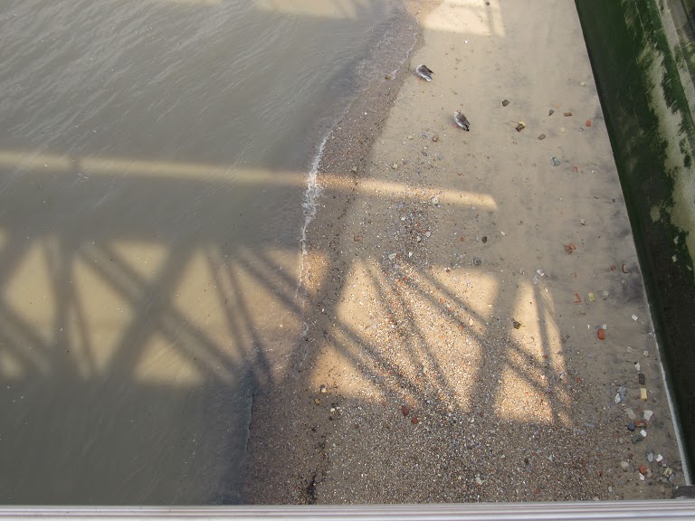
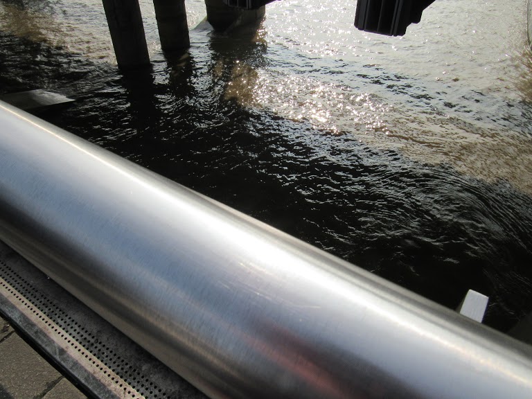
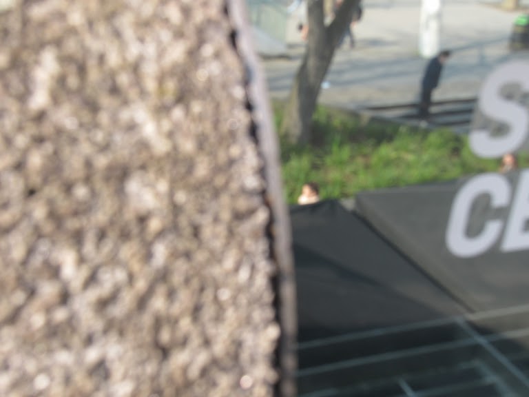
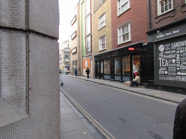
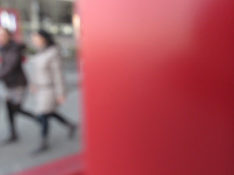
On a trip I took a selection of photographs at the south bank near one of Saul Leiters may galleries 'The photographers gallery'. I tried to focus on reflection and obstruction and in some images you can see that I have implied it in them. I also focused on colour, a colour that I have repeated in the majority of these images is red but not purposely. Red being a strong bold colour brings more attention as it stands out. Although I didn't get a chance to focus the camera on one specific thing so the rest is blurred out this because we were always moving.


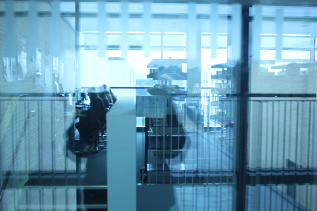
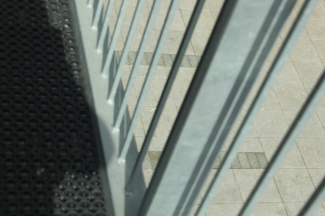
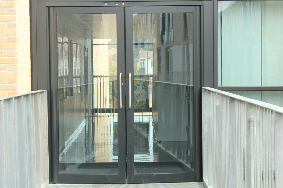
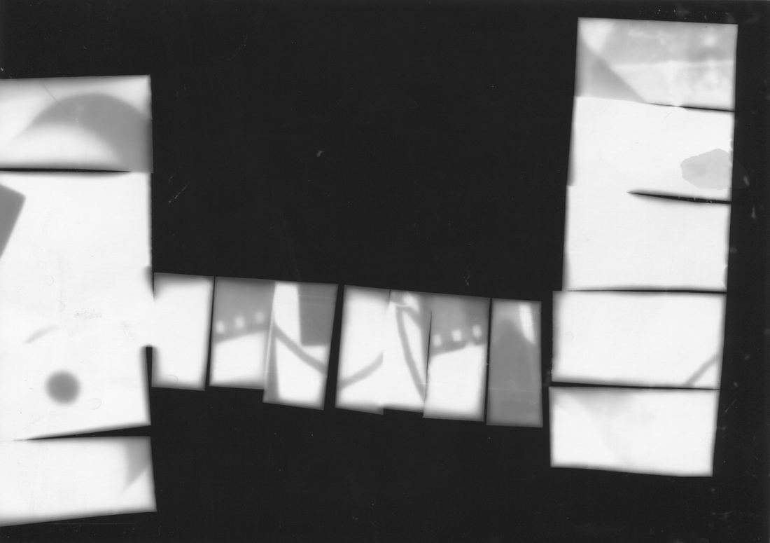
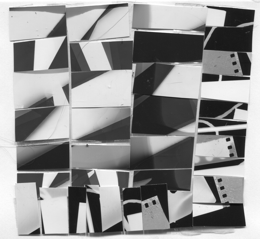
These 3 images are what I am going to use for my final piece. This is because each image complements one another and plays around with the idea reflection and focuses on one of the formal elements Shape and Line. These are similar to Saul Leiter because in his photographs he doesn't always focus the camera so the images are blurry and out of focus. In my first image I focused on the things in front and not on the main objects in the background which makes it more confusing but interesting. In addition, it's abstract as you can't tell what it is at first which is a main point of abstraction. Other formal elements it focuses on is light because the light from the sun reflects onto the glass and other doors which then cretaes an effect which is the reflection on both doors.
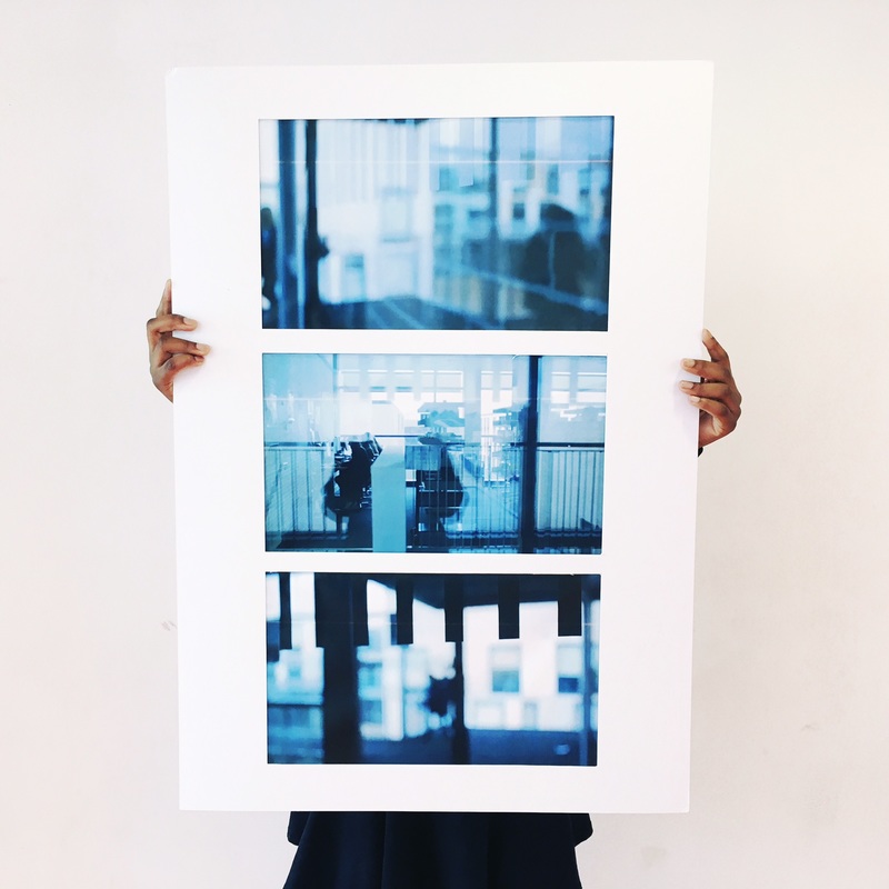
This is my final piece mounted on card. I am impressed that I was able to complete it in time. Each image is similar therefore it blends well together however this can be negative as they may blend too well that it looks the same. If I was to do this again I would add more images that would also look similar but not exactly the same.
